
What is an Infographic? Examples, Templates, Design Tips
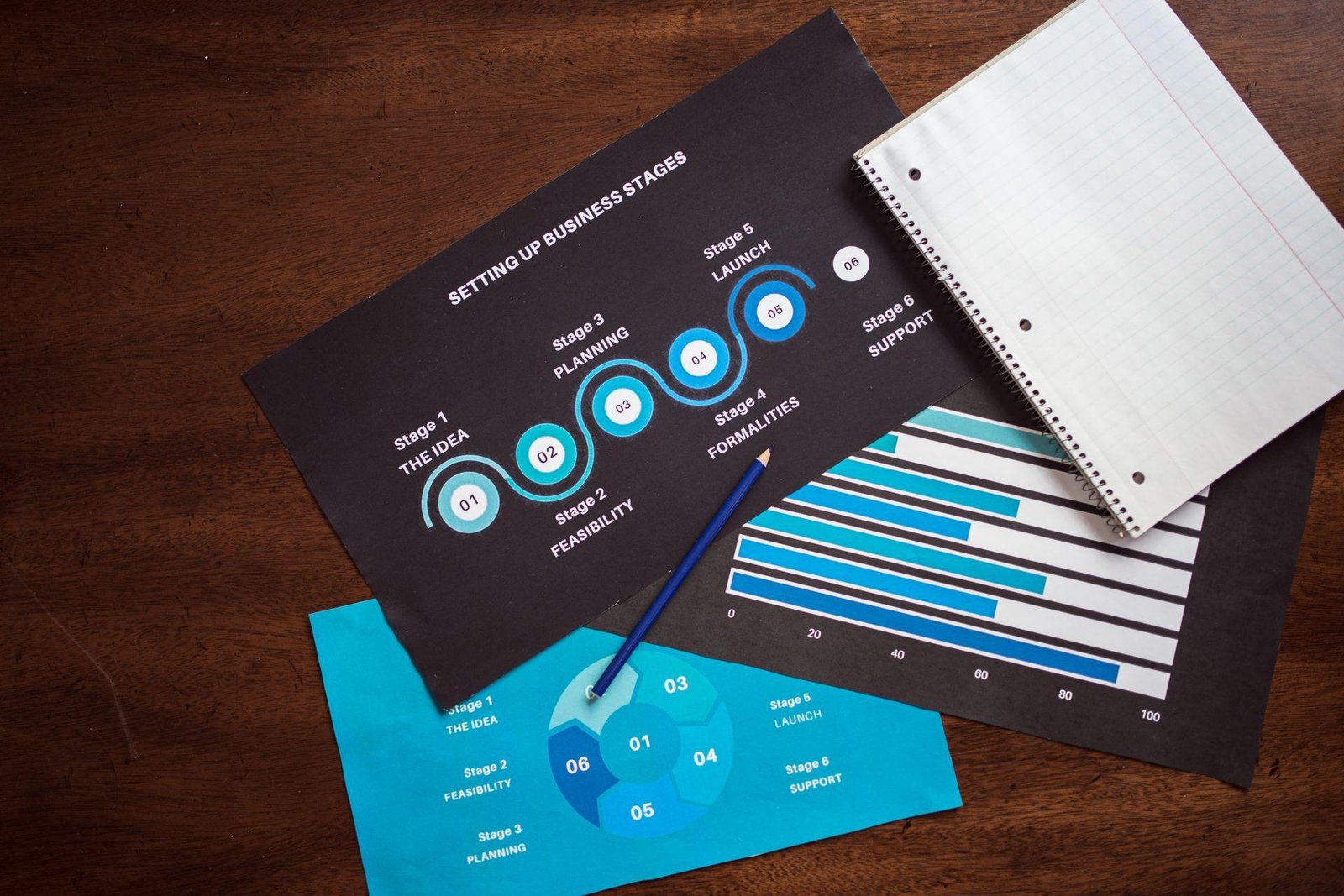
Every scroll on LinkedIn is a fight for about 1.7 seconds of attention. A wall of text loses that fight almost every time. A single, well-built visual… the kind that lets someone absorb your entire point before they've even stopped scrolling, usually wins it.
That visual is called: an infographic.
This guide covers what an infographic actually is, the situations where an infographic beats a plain post or slide deck, the main formats worth knowing, the design principles that separate a professional infographic from a cluttered one, and a realistic, modern path to making one — including where AI now removes most of the manual design work that used to make infographics a multi-hour project.
What Is an Infographic, Really?
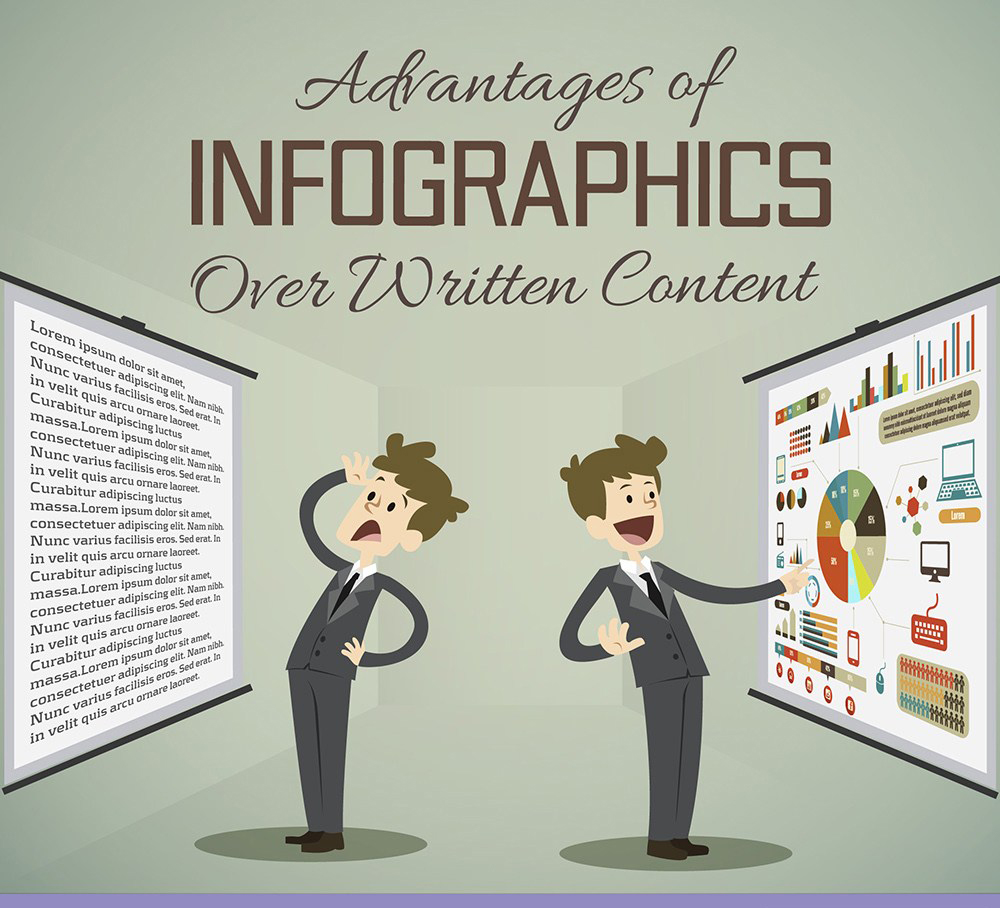
An infographic is a single visual document that turns information (data, a process, a comparison, an argument) into a layout you can understand primarily by looking at it, with text playing a supporting role rather than the leading one.
That last part is the detail most definitions skip. A slide with four bullet points and a stock photo is not an infographic. It's a slide with a picture on it. The difference is structural: in a real infographic, the layout itself carries meaning. Size, position, color, and grouping tell you what matters most before you've read a single word. Remove all the text and you should still be able to guess the shape of the message from the visual hierarchy alone.
That's also why infographics work so well on platforms like LinkedIn. A feed rewards content that communicates value in the first glance, and an infographic is, by design, built to do exactly that.
When an Infographic Beats a Text Post
Not every idea deserves a visual treatment. Use one when your content has one of these shapes:
- ■A number-driven claim. "73% of X happens because of Y" lands harder next to a chart than buried in a sentence.
- ■A sequence. Steps, stages, a before/after, anything with an implied order benefits from left-to-right or top-to-bottom visual flow.
- ■A structure. Org charts, category breakdowns, and frameworks are naturally spatial — forcing them into paragraphs makes the reader do the diagramming in their head.
- ■A comparison. Two or more options, side by side, are easier to judge visually than across three separate paragraphs.
- ■A single big idea you want remembered. Sometimes the goal isn't density. It's making one insight stick.
If your content is a personal story, an opinion with nuance, or something that depends on tone and voice, a plain text post will usually outperform a graphic. Infographics are a tool for clarity, not a replacement for every format.
The Core Infographic Formats
Rather than list every possible subtype, it's more useful to think in terms of the four jobs an infographic can do — almost every graphic you'll ever need falls into one of these:
01. The Data Story
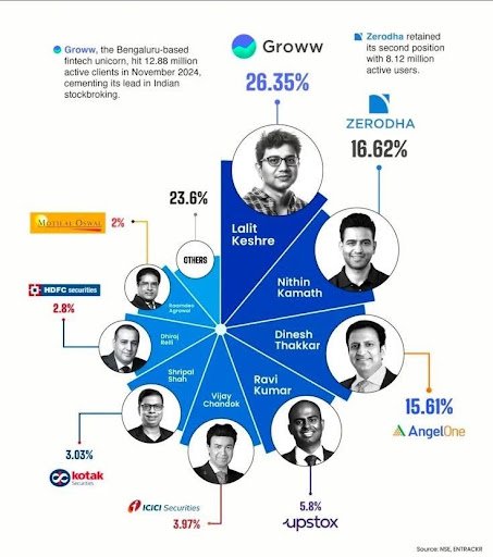
Built around one or more charts, this format exists to make a statistic land. It works best with very little supporting text — the number is the star, and everything else is a supporting cast member. Ideal for sharing survey results, market data, or performance metrics.
02. The Process Map
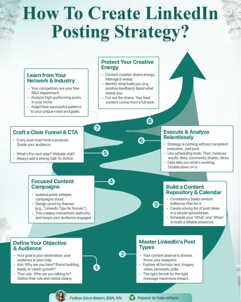
This format walks a reader through a sequence: a workflow, a framework, a "how it works" explainer. Arrows, numbered steps, and consistent visual rhythm from stage to stage do most of the communicating.
03. The Comparison Grid
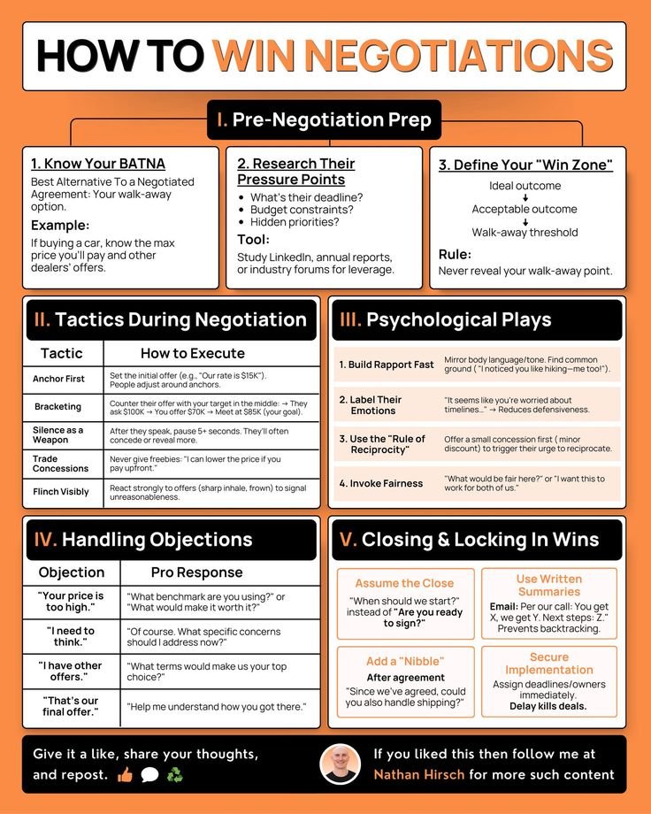
Side-by-side thinking, made visual. "Old way vs. new way," "Option A vs. Option B," or a feature comparison table dressed up with icons and color coding. This format is especially effective for positioning content — the kind that argues why your approach, product, or idea is the better choice.
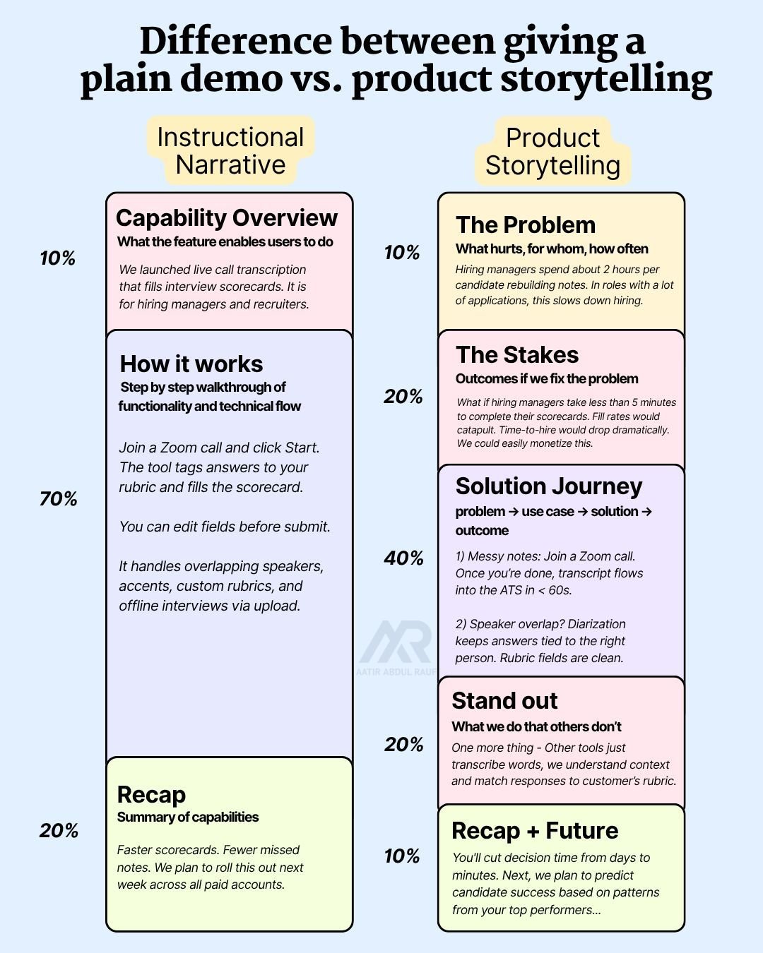
04. The Explainer
A denser format built to teach a concept from scratch, closer to a mini-lesson than a headline. It carries more text than the other three formats and is better suited to carousels or longer-form posts than a single quick-scroll image.
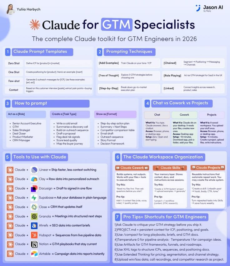
Most high-performing LinkedIn infographics are actually the first three. The fourth works, but it asks more of the reader's time, so it needs a genuinely strong hook to earn that attention.
The Five Things Every Strong Infographic Gets Right
Strip away the specific format, and every infographic that actually works shares five underlying qualities:
- ■A single point of entry. The eye should know exactly where to land first — usually the largest or highest-contrast element on the page. If two elements compete for that first glance, the design has already failed before anyone reads a word.
- ■Deliberate restraint on text. The instinct when you have a lot to say is to include all of it. Good infographics do the opposite: they cut until only the sentence that actually needs to exist remains.
- ■A limited, intentional palette. Two or three colors, used consistently, do more work than five colors used decoratively. Color should mean something — this metric is up, this category is different, this is the one thing to remember — not just look nice.
- ■Consistent visual weight. Icons, spacing, and font sizes should follow a repeatable system rather than being sized individually to "look right" in isolation. Inconsistency is the fastest way to make a graphic feel homemade.
- ■A message that survives without the caption. If your infographic only makes sense alongside three paragraphs of context in the post below it, the image isn't doing its job yet.
Where Most DIY Infographics Actually Go Wrong
It's rarely the concept that flops a DIY infographic. It's almost always one of three execution problems:
- ■Off-brand inconsistency. Colors, fonts, and spacing shift slightly from post to post because everything was rebuilt from scratch in a general-purpose design tool each time. Individually each post looks fine; as a body of work, nothing feels like it came from the same account.
- ■Text creep. What started as "just the key stat" slowly turns into four sentences, because it's always tempting to add "one more clarifying line." By the fifth addition, the hierarchy is gone.
- ■Template mismatch. A process gets forced into a statistic-style layout, or a comparison gets crammed into a template built for a timeline. The content and the format stop agreeing with each other, and readers feel that friction even if they can't name it.
All three are fixable, but they're also exactly the kind of small, repeated decisions that eat up the most time when you're designing manually, post after post, week after week.
How to Actually Build One (3 Realistic Paths)
There are three honest ways to end up with a finished infographic, and each has a real tradeoff:
If you're publishing infographics regularly — as most consistent LinkedIn creators eventually need to — Path 3 is worth trying first, simply because it removes the two most time-consuming parts of the process: starting from a blank page, and manually re-matching your brand every single time.
This is exactly the gap Visly was built to close. You type one sentence, or drop in a post you've already drafted, and Visly turns it into a polished, on-brand infographic in under 60 seconds — with your colors, fonts, and style locked in from the start instead of re-decided on every graphic. No template hunting, no prompt-engineering back-and-forth, no designer invoice.
A Simple Pre-Design Checklist
Before you open any tool — AI-powered or not — answer these four questions. They'll save you more time than any design shortcut:
- ■What's the one sentence someone should remember after seeing this? If you can't answer this in one sentence, the content isn't ready for a visual yet.
- ■Which of the four formats fits this content — data story, process map, comparison grid, or explainer?
- ■What's the single most important element, the one thing that should draw the eye first?
- ■Can I cut this by another 20%? Almost every first draft of infographic text can lose a fifth of its words without losing meaning.
Frequently Asked Questions
The Takeaway
An infographic earns its place when your idea has real shape — a number, a sequence, a comparison, a structure — and you want that shape to be visible before anyone reads a word. Get the hierarchy, restraint, and consistency right, and the format does more communicating in three seconds than most paragraphs manage in thirty.
The remaining question is just how much of the execution you want to do by hand. If you'd rather spend your time on the idea than the layout, try Visly free. Describe your post, and get a finished, on-brand infographic back in under 60 seconds. No credit card required.