
What is Unity in Design Principle and How to Use It (With Examples)
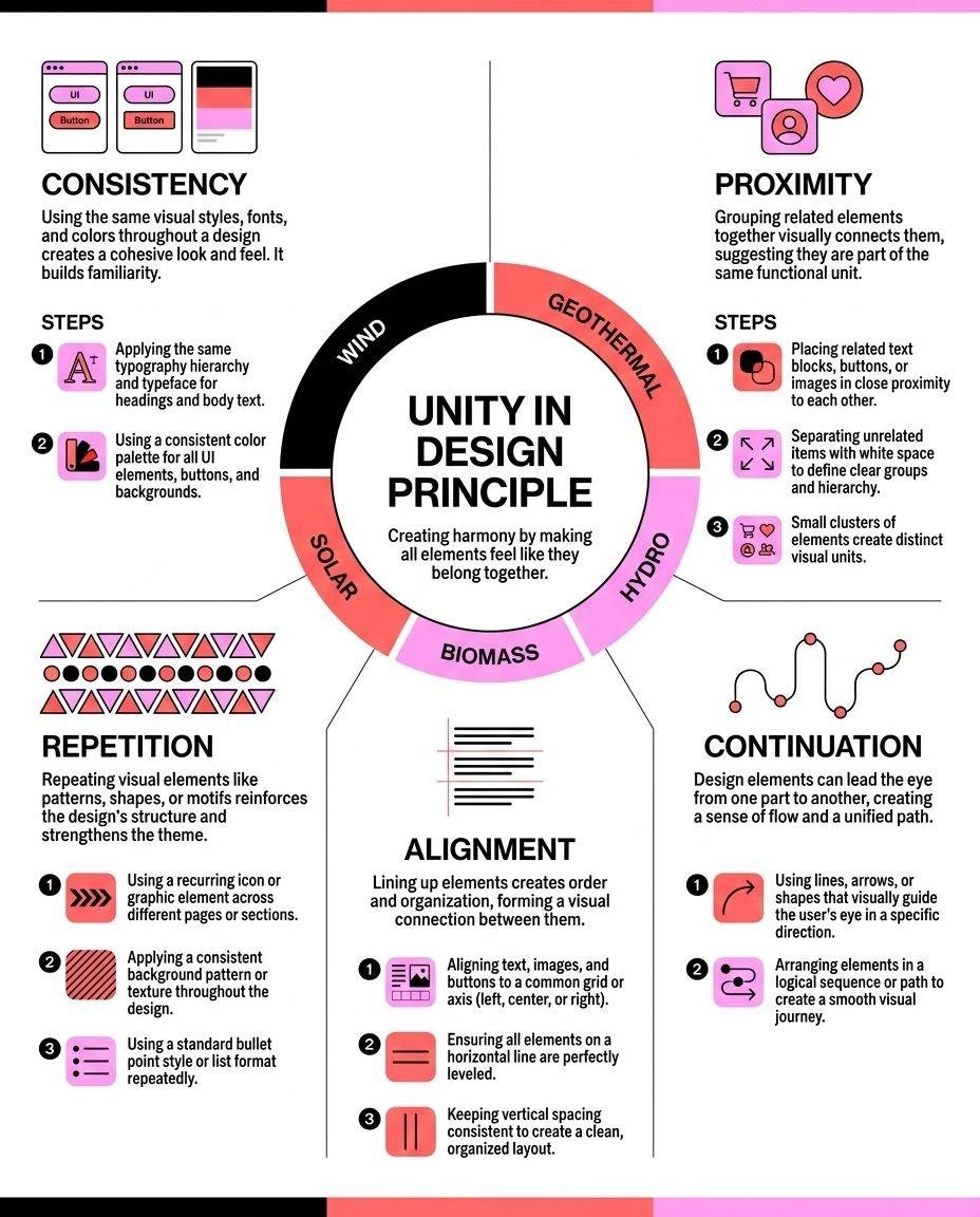
Some designs feel like one thing. Others feel like a pile of separate decisions that happened to end up on the same page. The difference between those two experiences is unity, and it's arguably the hardest design principle to explain because it isn't really its own technique. It's what happens when all your other techniques agree with each other.
This guide covers what unity means as a design principle, the difference between conceptual and visual unity, the specific building blocks that create it, where unity tips over into boring monotony, and a practical process for checking whether your own design actually holds together before you publish it.
What Unity Means in Design
Unity is the sense that every element in a design belongs to the same composition. Color, shape, texture, spacing, and typography all pull in the same direction instead of fighting each other for attention or feeling like they were borrowed from five different sources.
It's easy to confuse unity with sameness, but they're not the same thing. A design can use different colors, different shapes, and different image styles and still feel unified, as long as those choices share some underlying logic: a consistent palette family, a consistent line weight, a consistent level of detail. Unity is about coherence, not repetition for its own sake. You can also have a design where every element is technically similar (same color, same shape, same size) and it still fails to feel unified, because nothing about the arrangement suggests those elements are working together on purpose.
The opposite of unity is a design that feels stitched together. You'll usually spot it in graphics built by grabbing icons from three different icon packs, fonts from two different sources, and colors picked one at a time without checking how they sit next to each other. Nothing is technically wrong with any single element, but the whole doesn't add up to something coherent.
Conceptual Unity and Visual Unity Are Two Different Jobs
It helps to split unity into two separate questions, because they get solved in different ways.
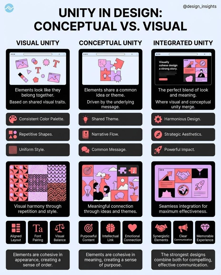
Conceptual unity is about the content: does the structure of your information make logical sense? If you're building an infographic, conceptual unity means your headline, your supporting points, and your conclusion all build toward the same message in an order that makes sense to a reader encountering it cold. You can have gorgeous visuals sitting on top of content that jumps around illogically, and the design will still feel unfocused no matter how nice the colors are.
Visual unity is about the execution: do the colors, shapes, spacing, and typography look like they belong to the same family? You can have a perfectly logical outline (great conceptual unity) rendered with clashing fonts and a scattered color palette, and the result will still feel disjointed, because the visual layer isn't backing up the structure underneath it.
The two reinforce each other. Strong conceptual unity gives you a natural structure to build your visual choices around: a clear hierarchy of headline, sub-point, and detail that tells you exactly which element should be biggest, boldest, or most saturated. Weak conceptual unity leaves you guessing at that hierarchy, which is usually when visual unity starts to slip too, since there's no clear logic left to visually reinforce.
Why Unity Actually Matters
Unity isn't just an aesthetic nicety. It does concrete work for a design.
- ■It speeds up comprehension. A unified design uses consistent visual language, meaning once a reader learns that a certain color marks "important" or a certain icon style marks "a step in the process," they can apply that pattern to the rest of the page without re-learning it section by section. Inconsistent designs force the reader to re-interpret the visual rules every time something looks slightly different, which slows them down even if they can't say exactly why.
- ■It makes contrast actually mean something. If everything on your page already looks similar, the one element that breaks the pattern (a bolder color, a bigger size) stands out immediately. If your design has no unity to begin with, there's no baseline for a contrasting element to stand out against, so emphasis stops working. Unity is what makes emphasis possible in the first place.
- ■It builds trust. A scattered, inconsistent design reads as unpolished even to viewers who couldn't name the specific problem. People associate visual coherence with competence, fairly or not, and that association attaches itself to whatever brand or message the design is carrying.
- ■It supports brand recognition over time. A single unified design is one thing. A body of unified designs, all sharing the same color logic, spacing, and typographic choices, is what actually makes an account or brand recognizable at a glance, before anyone reads a word of the content.
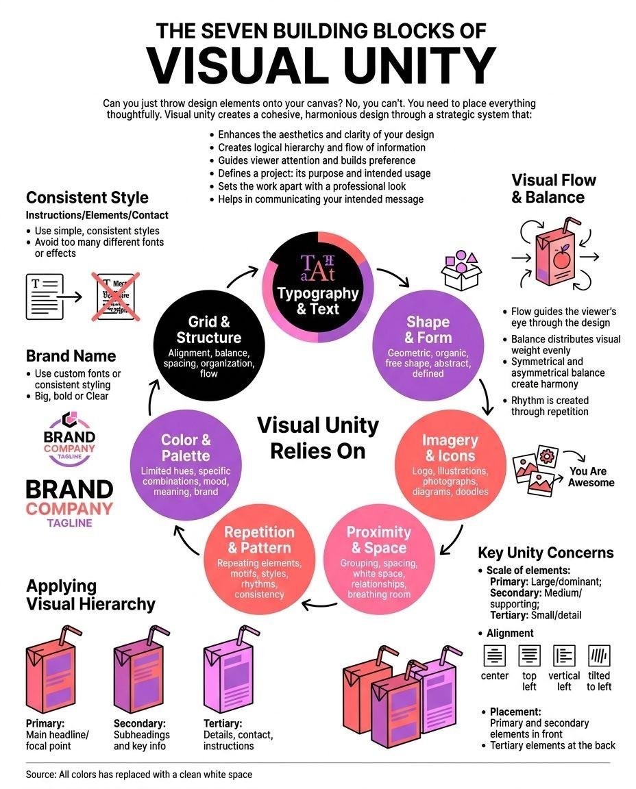
The Seven Building Blocks of Visual Unity
Unity isn't one lever. It's the combined effect of several smaller choices working together, and each one contributes something different.
01. Color Harmony
Color is usually the fastest way to break or build unity. A design using a tight palette (two or three core colors plus one or two neutrals) reads as coherent almost automatically, because the eye doesn't have to reconcile a lot of competing hues. Add a fourth or fifth color without a clear reason, and you introduce a small crack in the unity even if each individual color looks fine on its own.
02. Shape and Icon Consistency
Mixing icon styles is one of the fastest ways to undercut a design that's otherwise solid. A page of sharp, geometric icons next to one soft, hand-drawn illustration reads as inconsistent even if the content is perfectly organized. Pick one icon family, one corner radius, one line weight, and stick with it across the whole piece.
03. Texture
Texture is the perceived surface quality of an element: flat and smooth, grainy, patterned, glossy. A design that mixes a heavily textured photo background with flat vector icons and a smooth gradient can still work, but it needs a reason — usually one dominant texture with the others playing a supporting role — rather than three competing textures each trying to be the star.
04. Repetition
Repetition is reusing the same visual element, whether that's a shape, a color, a spacing rhythm, or a typographic treatment, across multiple parts of a design. In a multi-section infographic, repeating a simple visual motif (a small icon shape, a colored underline, a consistent header style) across every section is one of the most reliable ways to signal "these are all part of one document" without saying it in words.
05. Proximity
Proximity is the distance between elements, and it does more communicative work than people give it credit for. Elements placed close together read as related; elements placed far apart read as separate ideas. A design where everything sits at roughly the same distance from everything else gives the reader no clue about which points belong together, which undercuts unity even if every individual element looks polished.
06. Alignment
Alignment is whether elements share a common edge or axis. Even a small, consistent alignment system — everything snapped to a shared left edge, or every section centered on the same vertical line — creates an invisible structure that holds a design together. Break alignment inconsistently across a page (one section left-aligned, the next centered, the next right-aligned with no clear reason) and the whole thing starts to feel unplanned, even if no individual section looks bad.
07. Typography
Typography is often the quietest source of disunity because it's easy to justify each individual choice. One font for headlines, a different one for body text, and a third "just for this one callout" can each feel reasonable in isolation, but stacked together they read as three different documents glued into one. Limit yourself to two typefaces at most, one for headlines and one for body copy, and lean on weight and size to create hierarchy instead of reaching for a third font. The same discipline applies to type size: a page with six different font sizes scattered across headlines, subheads, and captions feels far less unified than one built on three or four sizes used consistently and repeatedly.
The Seven Building Blocks at a Glance
| Building block | What it controls | Fastest way to break it |
|---|---|---|
| Color harmony | Which hues feel like they belong together | Adding a new color for every new section instead of reusing the palette |
| Shape and icon consistency | Whether visual elements feel like one family | Mixing icon packs or illustration styles |
| Texture | The perceived surface quality of elements | Combining multiple competing textures with no dominant one |
| Repetition | Whether the piece reads as one document | Using a different visual motif in every section |
| Proximity | Which elements read as related | Spacing everything at the same generic distance |
| Alignment | Whether the layout feels planned | Switching alignment axis section to section with no reason |
| Typography | Whether the text feels like it belongs to one voice | Using three or more typefaces or a scattered range of sizes |
Color harmony
Controls: Which hues feel like they belong together
Fastest way to break it: Adding a new color for every new section instead of reusing the palette
Shape and icon consistency
Controls: Whether visual elements feel like one family
Fastest way to break it: Mixing icon packs or illustration styles
Texture
Controls: The perceived surface quality of elements
Fastest way to break it: Combining multiple competing textures with no dominant one
Repetition
Controls: Whether the piece reads as one document
Fastest way to break it: Using a different visual motif in every section
Proximity
Controls: Which elements read as related
Fastest way to break it: Spacing everything at the same generic distance
Alignment
Controls: Whether the layout feels planned
Fastest way to break it: Switching alignment axis section to section with no reason
Typography
Controls: Whether the text feels like it belongs to one voice
Fastest way to break it: Using three or more typefaces or a scattered range of sizes
Keeping Unity Across a Series, Not Just One Design
Most of what's covered so far applies to a single piece. But if you're publishing regularly, the harder version of this problem is keeping unity across dozens of separate designs over weeks or months, which is a different challenge from getting one graphic right.
The trap is that each individual post can pass every check on the list above and the body of work can still feel inconsistent, because the palette drifts slightly week to week, the icon style gets swapped out when a new pack catches your eye, or the spacing loosens as you move faster under a publishing deadline. None of these changes are dramatic enough to notice in any single post, but a regular reader scrolling through a week of your content will pick up on the drift even if they can't name it.
The fix is treating your seven building blocks as fixed decisions made once, documented somewhere, rather than choices you re-make from feel each time you sit down to design. A simple one-page style reference — your exact colors, your icon set, your two typefaces, your spacing rule — does more for long-term unity than any amount of care applied inconsistently post to post.
There's a real tension worth naming directly: push unity too hard and you get a design that's technically consistent but visually flat. If every section uses the identical layout, the identical color weighting, and the identical spacing with zero variation, readers lose any sense of where one idea ends and the next begins, and the whole piece starts to blur together.
The fix isn't abandoning unity — it's applying variety inside a unified system rather than outside it. Keep your core palette, your icon style, and your alignment logic consistent, but let one section run a little bolder, a little bigger, or a little more colorful than the rest to mark it as the most important point. That's still unity, since the underlying visual language hasn't changed, but it avoids the flatness of pure repetition. Unity and monotony look similar from a distance; the difference is whether variation happens within a shared system or completely outside it.
A Worked Example: Unifying a Five-Section Infographic
Say you're building an infographic with five sections, each covering a different statistic. Individually, each section might have its own headline, icon, and short paragraph. Walking through how unity gets built across all five makes the seven building blocks concrete.
Common Mistakes That Break Unity
The most frequent mistake is pulling icons, photos, or illustrations from multiple different style libraries in the same design. Each one might look fine alone; together, the mismatched styles read as visual noise.
The second is treating color as a decoration rather than a system. Adding a new color every time a section needs "something extra" instead of reusing colors already established elsewhere in the piece is one of the fastest ways to fragment an otherwise solid layout.
The third is inconsistent spacing between sections that are supposed to feel equivalent. If section one has generous padding and section three feels cramped, readers register that the sections aren't being treated the same way, even without consciously noticing the spacing itself.
The fourth is over-designing the first section of a multi-part piece and running out of energy by the last one, so the opening looks polished and considered while the ending feels rushed and thinner. Consistency across the entire piece, not just the first impression, is what unity actually requires.
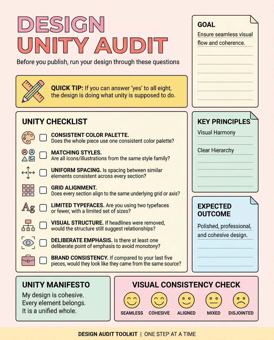
A Quick Checklist for Auditing Unity
Before you publish, run your design through these questions:
- ■Does the whole piece use one consistent color palette, with any additional colors serving a clear, repeated purpose?
- ■Are all icons or illustrations from the same style family?
- ■Is spacing between similar elements consistent across every section?
- ■Does every section align to the same underlying grid or axis?
- ■Are you using two typefaces or fewer, with a consistent, limited set of sizes?
- ■If you removed the headlines, would the visual structure alone still suggest which points are related and which are separate?
- ■Is there at least one deliberate point of emphasis, so the unity doesn't flatten into monotony?
- ■If you compared this piece to your last five, would they look like they came from the same source?
If you can answer yes to all eight, the design is doing what unity is supposed to do.
Building Unity Without Rebuilding It From Scratch Every Time
Everything above works, but doing it by hand on every single graphic you publish is exactly the kind of repetitive decision-making that eats up time, especially if you're publishing regularly without formal design training to fall back on.
This is the real argument for locking your visual system once instead of rebuilding it project by project. If your color palette, icon style, spacing rules, and typography are already defined and consistent, every new piece you create inherits unity automatically instead of you re-deciding the same seven building blocks from a blank canvas each time.
That's the problem Visly is built to solve. You set your brand's colors, fonts, and style once, and every infographic generated after that keeps the same unified visual language, the same icon logic, the same spacing — without you having to manually check color harmony and alignment on every single post.
Try Visly free and get a unified, on-brand infographic in under 60 seconds. No credit card required.