
The 25 Best Shades of Dark Red (+ HEX Codes)
Dark red carries more weight than almost any other color in the wheel. It's the color of wine labels and luxury car interiors, but it's also the color that makes a "danger" sign feel urgent and a horror movie poster feel tense. That range, from opulent to alarming, is exactly why picking the wrong shade of dark red can undercut a design without anyone quite knowing why.
This guide covers all 25 classic shades of dark red with their real HEX code, RGB value, CMYK breakdown, and WCAG contrast ratios against both white and black text. Those numbers matter more than they get credit for. A shade that looks rich and moody on your screen can fail basic accessibility the moment you put text on it, and most color roundups never tell you that until you've already shipped the design. We've also added 5 bonus shades and a full section on how to actually use dark red without it reading as aggressive or dated.
Quick-Reference Table
Bookmark this. Every value below is calculated directly from the HEX code, so the contrast ratios are exact, not estimated.
| # | Shade | HEX | RGB | CMYK | vs White | vs Black |
|---|---|---|---|---|---|---|
| 1 | Mordant Red 19 | #AE0C00 | 174, 12, 0 | 0, 93, 100, 32 | 7.36 | 2.85 |
| 2 | Rufous | #A81C07 | 168, 28, 7 | 0, 83, 96, 34 | 7.41 | 2.83 |
| 3 | Firebrick | #B22222 | 178, 34, 34 | 0, 81, 81, 30 | 6.68 | 3.14 |
| 4 | Vivid Auburn | #922724 | 146, 39, 36 | 0, 73, 75, 43 | 8.27 | 2.54 |
| 5 | Deep Carmine | #A9203E | 169, 32, 62 | 0, 81, 63, 34 | 7.09 | 2.96 |
| 6 | Saddle Brown | #8B4513 | 139, 69, 19 | 0, 50, 86, 45 | 7.10 | 2.96 |
| 7 | Dark Chestnut | #986960 | 152, 105, 96 | 0, 31, 37, 40 | 4.64 | 4.52 |
| 8 | Vivid Burgundy | #9F1D35 | 159, 29, 53 | 0, 82, 67, 38 | 7.77 | 2.70 |
| 9 | Deep Coffee | #704241 | 112, 66, 65 | 0, 41, 42, 56 | 8.25 | 2.54 |
| 10 | Dark Raspberry | #872657 | 135, 38, 87 | 0, 72, 36, 47 | 8.59 | 2.45 |
| 11 | Harvard Crimson | #C90016 | 201, 0, 22 | 0, 100, 89, 21 | 6.01 | 3.50 |
| 12 | Ferrari Red | #FF2800 | 255, 40, 0 | 0, 84, 100, 0 | 3.78 | 5.56 |
| 13 | Rust | #B7410E | 183, 65, 14 | 0, 64, 92, 28 | 5.56 | 3.78 |
| 14 | Rose Vale / English Red | #AB4E52 | 171, 78, 82 | 0, 54, 52, 33 | 5.33 | 3.94 |
| 15 | Crimson | #DC143C | 220, 20, 60 | 0, 91, 73, 14 | 4.99 | 4.21 |
| 16 | Falu Red | #801818 | 128, 24, 24 | 0, 81, 81, 50 | 10.19 | 2.06 |
| 17 | Upsdell Red | #AE2029 | 174, 32, 41 | 0, 82, 76, 32 | 6.91 | 3.04 |
| 18 | UA Red | #D9004C | 217, 0, 76 | 0, 100, 65, 15 | 5.18 | 4.05 |
| 19 | Crimson Red | #990000 | 153, 0, 0 | 0, 100, 100, 40 | 8.92 | 2.35 |
| 20 | Dark Candy Apple Red | #A40000 | 164, 0, 0 | 0, 100, 100, 36 | 8.14 | 2.58 |
| 21 | Carnelian / Cornell | #B31B1B | 179, 27, 27 | 0, 85, 85, 30 | 6.80 | 3.09 |
| 22 | Persian Red | #CC3333 | 204, 51, 51 | 0, 75, 75, 20 | 5.14 | 4.09 |
| 23 | Pale Carmine | #AF4035 | 175, 64, 53 | 0, 63, 70, 31 | 5.82 | 3.61 |
| 24 | Venetian Red | #C80815 | 200, 8, 21 | 0, 96, 89, 22 | 6.00 | 3.50 |
| 25 | Chocolate Cosmos | #560319 | 86, 3, 25 | 0, 97, 71, 66 | 14.76 | 1.42 |
#1
Mordant Red 19
#AE0C00
#2
Rufous
#A81C07
#3
Firebrick
#B22222
#4
Vivid Auburn
#922724
#5
Deep Carmine
#A9203E
#6
Saddle Brown
#8B4513
#7
Dark Chestnut
#986960
#8
Vivid Burgundy
#9F1D35
#9
Deep Coffee
#704241
#10
Dark Raspberry
#872657
#11
Harvard Crimson
#C90016
#12
Ferrari Red
#FF2800
#13
Rust
#B7410E
#14
Rose Vale / English Red
#AB4E52
#15
Crimson
#DC143C
#16
Falu Red
#801818
#17
Upsdell Red
#AE2029
#18
UA Red
#D9004C
#19
Crimson Red
#990000
#20
Dark Candy Apple Red
#A40000
#21
Carnelian / Cornell
#B31B1B
#22
Persian Red
#CC3333
#23
Pale Carmine
#AF4035
#24
Venetian Red
#C80815
#25
Chocolate Cosmos
#560319
Why contrast ratios matter: WCAG 2.1 asks for a ratio of at least 4.5:1 for normal body text and 3:1 for large text or graphics to count as accessible. Look at the spread above. Chocolate Cosmos and Falu Red clear 10:1 against white, which puts them in near-black territory for legibility. Ferrari Red, on the other hand, only manages 3.78 against white, so it fails the body-text threshold outright. That's the kind of detail a swatch image can't tell you, and it's exactly why we're giving you the number instead of just the color chip.
The 25 Shades in Detail
1) Mordant Red 19
HEX #AE0C00 · RGB 174, 12, 0 · CMYK 0, 93, 100, 32
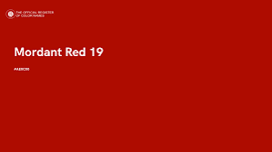
This shade started life as a textile dye name, and it still carries that slightly industrial precision. It's a true orange-leaning red rather than a red with brown mixed in, which makes it punchier than most "dark red" shades on this list. At 7.36 contrast against white, it's a safe pick for headlines and large blocks of text.
Best for: bold CTA buttons, sale banners, anywhere you want urgency without going full stop-sign red
2) Rufous
HEX #A81C07 · RGB 168, 28, 7 · CMYK 0, 83, 96, 34
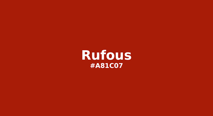
Rufous is the color ornithologists actually use to describe the reddish-brown feathers on certain birds, and that natural origin shows. It reads as warm and grounded rather than alarming. Contrast against white sits at 7.41, comfortably clearing the accessibility bar.
Best for: organic and earthy branding, autumn-themed content, packaging for natural or artisanal goods
3) Firebrick
HEX #B22222 · RGB 178, 34, 34 · CMYK 0, 81, 81, 30
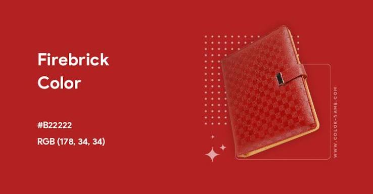
Named for the color of fired clay brick, this shade sits right in the middle of the dark red family: not too orange, not too purple. A 6.68 contrast ratio against white keeps it dependable for both text and interface elements.
Best for: structural or architectural branding, warning states in UI that need to feel serious but not panicked
4) Vivid Auburn
HEX #922724 · RGB 146, 39, 36 · CMYK 0, 73, 75, 43
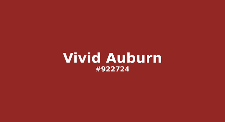
A deeper, more muted cousin of standard auburn, closer to dried clay than hair color. It has real weight to it. At 8.27 contrast against white, it holds up well as a heading color on a light background.
Best for: editorial headlines, fall and winter campaigns, vintage-leaning branding
5) Deep Carmine
HEX #A9203E · RGB 169, 32, 62 · CMYK 0, 81, 63, 34
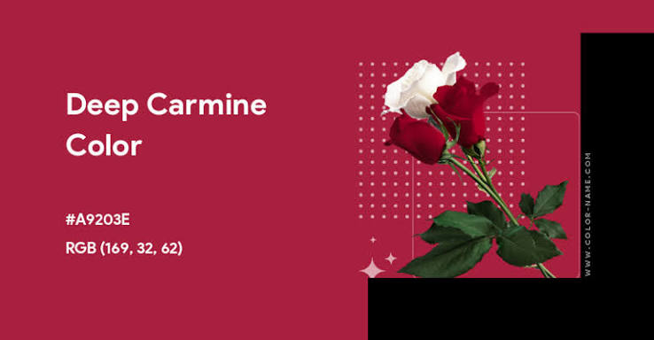
Carmine on its own carries a slightly pink undertone; the "deep" version pulls that back toward wine. It's one of the more versatile shades here, sitting almost exactly between pure red and burgundy. Contrast against white: 7.09.
Best for: luxury cosmetics, wine and spirits labels, fashion branding
6) Saddle Brown
HEX #8B4513 · RGB 139, 69, 19 · CMYK 0, 50, 86, 45
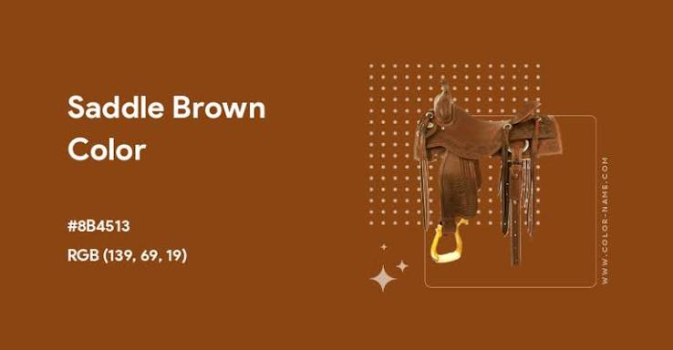
This one sits at the very edge of the dark red family since it leans hard into brown, which is exactly why it gets included in these lists so often: it's the bridge color between red and brown palettes. A 7.10 contrast ratio against white makes it perfectly legible as body text.
Best for: leather goods, western and heritage branding, warm neutral backgrounds
7) Dark Chestnut
HEX #986960 · RGB 152, 105, 96 · CMYK 0, 31, 37, 40
The most desaturated shade on this list, closer to a muted rose-brown than a true red. Its contrast values (4.64 against white, 4.52 against black) are nearly balanced, meaning it's one of the only shades here that works reasonably well with either light or dark text.
Best for: minimalist branding, muted or "quiet luxury" palettes, background wash colors
8) Vivid Burgundy
HEX #9F1D35 · RGB 159, 29, 53 · CMYK 0, 82, 67, 38
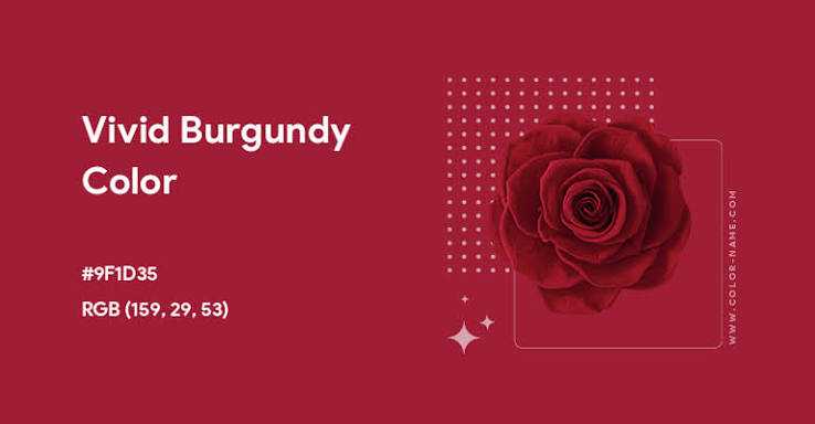
Real burgundy without the brown mixed in, so it reads as more purple-leaning red than the wine-and-brown burgundy people usually picture. Contrast against white sits at 7.77.
Best for: premium branding, formalwear, awards and certificate design
9) Deep Coffee
HEX #704241 · RGB 112, 66, 65 · CMYK 0, 41, 42, 56
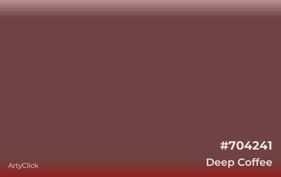
Genuinely closer to brown than red, but with enough warmth in the undertone to earn its place in the family. A 8.25 contrast ratio against white keeps it solidly legible.
Best for: coffee and food branding, warm interior palettes, cozy editorial design
10) Dark Raspberry
HEX #872657 · RGB 135, 38, 87 · CMYK 0, 72, 36, 47
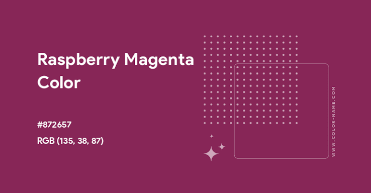
The most purple-leaning shade on the list, sitting right at the edge between red and magenta. At 8.59 contrast against white, it's one of the stronger performers here for text legibility.
Best for: beauty and fashion branding, bold accent colors, anything that wants a red with a little more attitude
11) Harvard Crimson
HEX #C90016 · RGB 201, 0, 22 · CMYK 0, 100, 89, 21
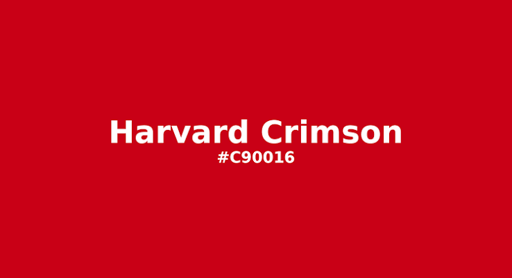
The official color of Harvard University, and one of the most saturated shades on this list. It carries built-in associations with academic prestige and tradition wherever it's used. Contrast against white: 6.01.
Best for: academic branding, formal institutions, certificates and diplomas
12) Ferrari Red
HEX #FF2800 · RGB 255, 40, 0 · CMYK 0, 84, 100, 0
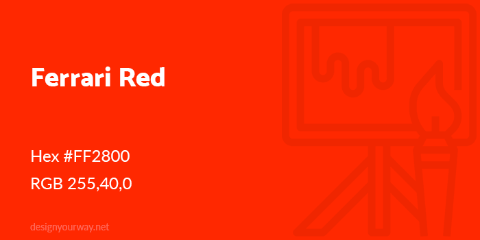
The brightest, most saturated shade on this list by far, and honestly more of a true red than a dark one. It's included here because it's requested constantly, but the numbers tell the real story: 3.78 contrast against white fails the accessibility bar for body text entirely. Use it for large text or icons only, and pair it with black rather than white for the strongest contrast (5.56).
Best for: automotive branding, high-energy sports content, sparing use as an accent rather than a background
13) Rust
HEX #B7410E · RGB 183, 65, 14 · CMYK 0, 64, 92, 28
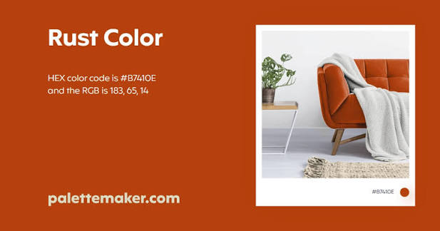
The color of oxidized iron, and one of the most popular "dark red" shades in interior design over the last several years. Warm, earthy, and forgiving to pair with. Contrast against white: 5.56.
Best for: interior decor, vintage and industrial branding, autumn product lines
14) Rose Vale / English Red
HEX #AB4E52 · RGB 171, 78, 82 · CMYK 0, 54, 52, 33
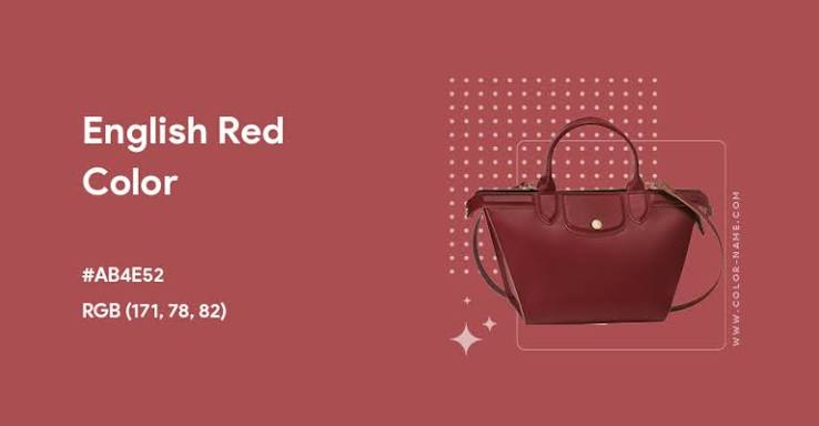
A dusty, muted red with a soft pink undertone; it reads as romantic without tipping into pastel territory. A 5.33 contrast ratio against white keeps it usable for text, though it's better suited to headlines than dense paragraphs.
Best for: wedding and event branding, soft feminine palettes, greeting cards
15) Crimson
HEX #DC143C · RGB 220, 20, 60 · CMYK 0, 91, 73, 14
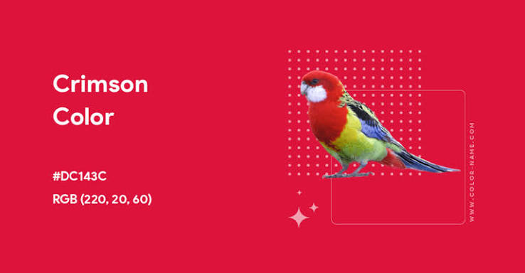
Possibly the most recognizable named red after "red" itself, historically derived from crushed insect dye. Contrast against white is only 4.99, right at the edge of the AA threshold, so double-check any body text set in this color against your actual background before shipping it.
Best for: marketing accents, holiday campaigns, sports team branding
16) Falu Red
HEX #801818 · RGB 128, 24, 24 · CMYK 0, 81, 81, 50

Named for the copper mine pigment used to paint traditional Swedish houses, this shade has genuine rustic history behind it. At 10.19 contrast against white, it's one of the strongest performers on this list for text legibility.
Best for: rustic and heritage branding, cabin and countryside aesthetics, vintage packaging
17) Upsdell Red
HEX #AE2029 · RGB 174, 32, 41 · CMYK 0, 82, 76, 32
A balanced, slightly cool-leaning red that sits comfortably between Firebrick and Crimson. Contrast against white: 6.91, safely inside accessible range.
Best for: corporate branding, formal reports, general-purpose accent color
18) UA Red
HEX #D9004C · RGB 217, 0, 76 · CMYK 0, 100, 65, 15
The most pink-shifted shade on the list, closer to magenta than most people expect from a "dark red." Contrast against white sits at 5.18, workable but worth checking at your actual font size.
Best for: youth sports branding, bold streetwear, high-visibility accent use
19) Crimson Red
HEX #990000 · RGB 153, 0, 0 · CMYK 0, 100, 100, 40
A pure, saturated red-black with no brown or purple pulling it off course. Contrast against white is a strong 8.92, making it one of the safest choices here for both headlines and body copy.
Best for: classic branding, formal invitations, high-contrast web design
20) Dark Candy Apple Red
HEX #A40000 · RGB 164, 0, 0 · CMYK 0, 100, 100, 36
Named for the glossy candy-apple coating rather than the fruit itself, this shade carries a slightly glossy, saturated feel even without any actual shine applied. Contrast against white: 8.14.
Best for: automotive and product design, holiday and seasonal branding
21) Carnelian / Cornell
HEX #B31B1B · RGB 179, 27, 27 · CMYK 0, 85, 85, 30
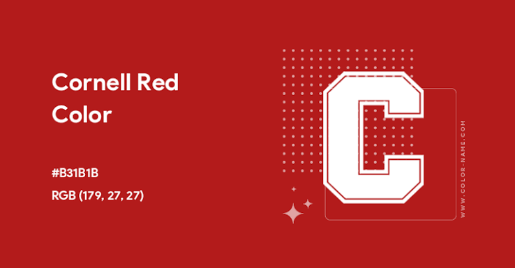
Named for the reddish-brown gemstone, Carnelian has a mineral, almost polished quality to it. A 6.80 contrast ratio against white keeps it dependable for most design uses.
Best for: jewelry branding, luxury goods, warm accent walls in interior design
22) Persian Red
HEX #CC3333 · RGB 204, 51, 51 · CMYK 0, 75, 75, 20
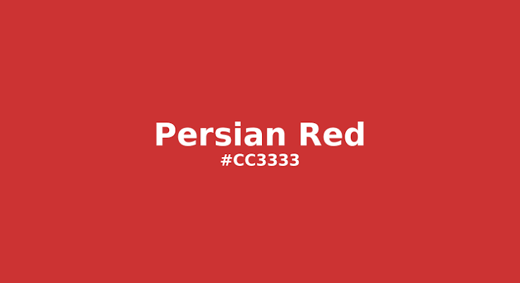
Softer and less saturated than Crimson or Harvard Crimson, with a slightly muted quality that reads as approachable rather than alarming. Contrast against white: 5.14, right at the edge of AA compliance.
Best for: friendly brand accents, editorial pull-quotes, warm call-out boxes
23) Pale Carmine
HEX #AF4035 · RGB 175, 64, 53 · CMYK 0, 63, 70, 31
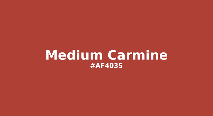
Despite the name, this isn't especially pale; it's simply lighter and warmer than standard Carmine, with an orange undertone. Contrast against white: 5.82.
Best for: warm editorial design, food and beverage branding, autumn palettes
24) Venetian Red
HEX #C80815 · RGB 200, 8, 21 · CMYK 0, 96, 89, 22
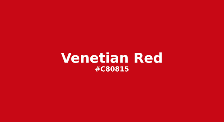
One of the oldest documented pigment names in art history, originally derived from natural iron oxide clay. It carries genuine old-world weight, which is why it still shows up in fine art and classical branding. Contrast against white: 6.00.
Best for: art and design branding, classical or historical content, museum and gallery use
25) Chocolate Cosmos
HEX #560319 · RGB 86, 3, 25 · CMYK 0, 97, 71, 66
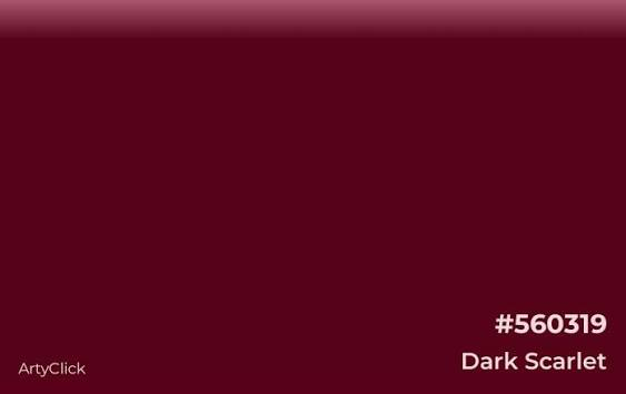
Named for the flower, which is famous for smelling faintly of chocolate, this is the darkest true red on the list. At 14.76 contrast against white, it functions almost like a near-black, making it an excellent substitute for pure black anywhere you want a hint of warmth in the shadows.
Best for: premium dark-mode UI, luxury packaging, moody photography overlays
5 Bonus Shades Worth Knowing
A "complete" guide to dark red shouldn't skip the five names people search for most. Here they are, with the same full data set:
| Shade | HEX | vs White |
|---|---|---|
| Oxblood | #4A0404 | 16.03 |
| Maroon | #800000 | 10.95 |
| Wine | #722F37 | — |
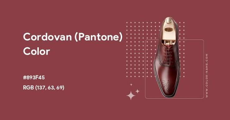
| Cordovan | #893F45 | — |
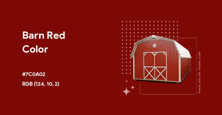
| Barn Red | #7C0A02 | 11.05 |
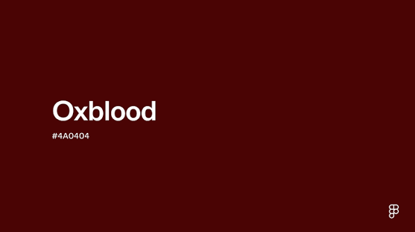
Oxblood (#4A0404): The deepest, most brown-shifted red on this whole list, with a 16.03 contrast ratio against white. A staple in British fashion and footwear branding.
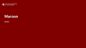
Maroon (#800000): The shade people picture first when they hear "dark red." Balanced, safe, and a dependable default at 10.95 contrast against white.
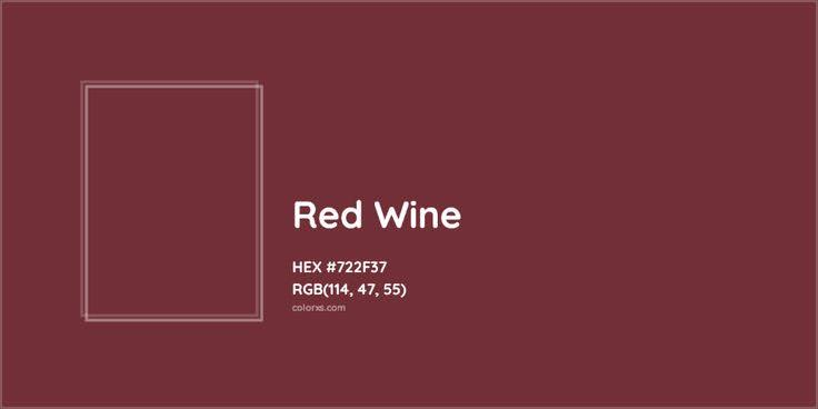
Wine (#722F37): Muted and sophisticated, closer to a true burgundy with a hint of gray mixed in. Works well in quiet, minimalist palettes.
Cordovan (#893F45): Named for a type of Spanish leather, with a dusty rose-brown quality that pairs beautifully with cream and tan.
Barn Red (#7C0A02): The classic American barn paint color, warm and slightly orange-shifted with an 11.05 contrast ratio against white.
The Psychology of Dark Red
Red sits at the most physiologically intense end of the visible spectrum, and dark red inherits that intensity while trading away brightness for weight and seriousness.
- ■Brown-leaning dark reds (Rufous, Saddle Brown, Rust, Falu Red) read as earthy, grounded, and natural. They soften red's aggression into something closer to comfort.
- ■Purple-leaning dark reds (Dark Raspberry, Vivid Burgundy, UA Red) read as luxurious and a little dramatic, borrowing purple's association with richness and rarity.
- ■Pure, near-black dark reds (Chocolate Cosmos, Falu Red, Maroon) carry the most gravity of the whole family, similar to how near-black greens borrow authority from black while keeping a touch of warmth.
It's also worth being direct about red's more primal association: danger, urgency, and blood. That's not a reason to avoid dark red, but it is a reason to be deliberate about which shade you pick. A brand that wants "confident and established" should reach for Maroon or Oxblood. A brand that wants "act now" should reach for something closer to Ferrari Red or Harvard Crimson. Confusing the two is how a fine dining restaurant ends up looking like a fire alarm.
How to Actually Use These Shades (Not Just Look at Them)
In branding and logo design
Match the undertone to your brand's personality before you match the darkness. A brown-leaning red like Rust says something completely different from a purple-leaning red like Dark Raspberry, even though both are technically "dark red." Mixing the two in one palette usually reads as a mistake rather than a deliberate choice.


In web and product design
Check your contrast numbers before you commit to anything. Several shades on this list, including Ferrari Red, Crimson, and Persian Red, sit right at or below the WCAG threshold for body text against white. They're still great colors. They just need to be used as accents, buttons, or large headlines rather than paragraph text.
In infographics and presentations
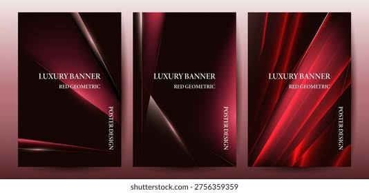
The darkest shades here — Chocolate Cosmos, Oxblood, and Falu Red — all clear a contrast ratio above 10 against white, which makes them excellent background colors for text-heavy graphics. Save your brightest reds for a single highlighted data point rather than the whole background; a full slide in Ferrari Red gets tiring fast.
In interior decor
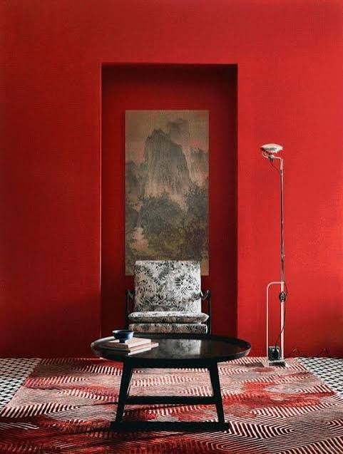
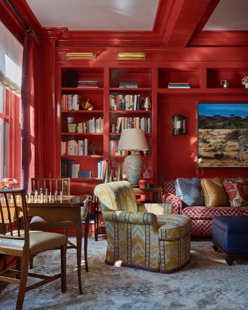
Dark red has had a real moment in dining rooms and libraries over the last few years, particularly shades like Rust, Oxblood, and Barn Red, which pair naturally with warm wood tones, brass fixtures, and leather furniture.
Pairing Palettes That Actually Work
Modern & minimal
Chocolate Cosmos + warm white (#F7F2ED) + a single brass or gold accent
Luxury & fashion
Vivid Burgundy + cream + black
Rustic & heritage
Rust + Falu Red + a warm neutral (oat, tan)
Bold & energetic
Ferrari Red + charcoal + white, used sparingly
Academic & institutional
Harvard Crimson + white + a muted gray
Frequently Asked Questions
Turn Any of These Shades Into a Finished Design in Minutes
Picking the right HEX code is only the first step. The real work is building something with it, on brand, every time. If you're creating content for LinkedIn, Visly turns a single sentence into a polished infographic in under 60 seconds, with your exact dark red locked into your brand kit from the start.