
What is Balance in Design Principle and How to Use It (With Examples)
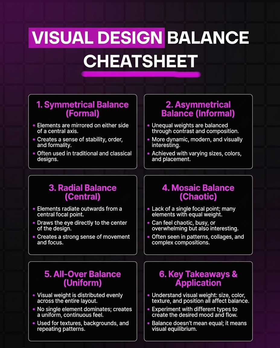
Look at ten LinkedIn infographics in a row and you can usually tell which ones a designer touched without reading a single word. It's rarely the color choices or the icon set that gives it away. It's balance: whether the page feels settled or whether one corner is dragging your eye away from everything else.
Balance is one of those design principles that's easy to feel and hard to name. This guide breaks it down properly: what balance means, the five main types you'll run into, the specific factors that create visual weight, and a practical process for checking your own designs before you publish them.
What Balance Means in Design
Balance is how visual weight gets distributed across a layout. Every element on a page — a heading, an icon, a chart, a block of color — carries some amount of weight, and balance is what happens when that weight is arranged so no single part of the page overpowers the rest.
The word "balance" makes people picture a scale with equal amounts on both sides, and that trips a lot of beginners up. Equal weight is one way to get there, but it's not the only way, and it's often not even the best way. A balanced design just means the page holds together as one composition instead of splitting into a strong side and a weak side. A tiny bright red icon in the corner of an otherwise pale, quiet layout can outweigh a huge gray block of text, and that's still balance — just not the symmetrical kind.
Understanding this early saves a lot of frustration. If you're staring at a layout that feels wrong and you keep trying to make both halves identical, you might be solving the wrong problem.
The Five Factors That Create Visual Weight
Before you can balance a design, you need to know what makes something feel heavy or light on a page. Size is the most obvious one: bigger elements pull more attention than smaller ones. But size isn't the whole story.
- ■Color plays a huge role. A small patch of saturated red or orange can carry as much visual weight as a much larger block of pale gray or beige. Warm, bright, high-contrast colors read as heavier than cool, muted, low-contrast ones.
- ■Position matters too. Elements near the center of a page, or elements that sit higher up, tend to feel more prominent than elements pushed to the edges or the bottom. This is partly because most readers scan top to bottom and center-out.
- ■Texture and complexity add weight as well. A busy icon with a lot of detail feels heavier than a simple flat shape of the same size. The same goes for text: a dense paragraph feels heavier than a short headline, even at the same width, because there's more for the eye to process.
- ■Isolation is the factor people miss most often. A single element surrounded by empty space draws attention out of proportion to its actual size, because it has nothing competing with it. This is why a small logo alone in a corner can carry real visual weight even though it's tiny.
Once you can see these five factors, evaluating balance stops being a vague feeling and starts being a checklist.
The Five Types of Balance
01. Symmetrical Balance
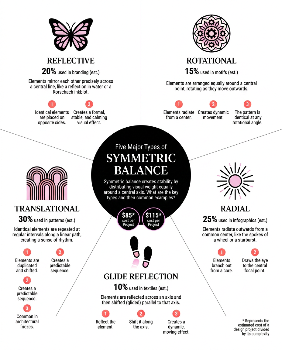
Symmetrical balance mirrors elements across a central axis, so one half of the design is roughly a reflection of the other. It reads as formal, stable, and orderly, which makes it a strong fit for certificates, official reports, or any design where you want to communicate structure and trust rather than energy.
The tradeoff is that pure symmetry can feel static. Used constantly, it starts to look like a template rather than a considered layout.
02. Asymmetrical Balance
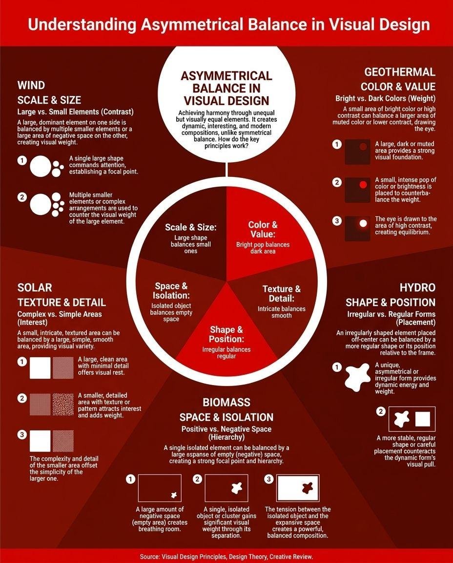
Asymmetrical balance distributes different elements unevenly across a page while still keeping the overall composition settled. A large image on one side might be balanced by a smaller but more saturated block of text and color on the other. Neither side mirrors the other, but neither side feels like it's winning either.
This is the type of balance most modern infographics and social posts use, because it creates movement and interest without tipping into chaos. It also takes more practice to get right, since you can't just mirror an element and call it done. You have to judge weight, not position.
03. Radial Balance
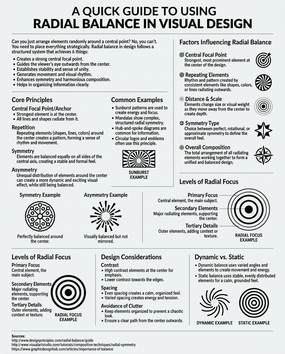
Radial balance arranges elements around a single central point, like spokes on a wheel. It's a natural fit whenever your content already has one central idea with several supporting points branching off it: a mind map, a hub-and-spoke process, a single stat surrounded by context.
The center point does most of the work here. Get it right and the eye naturally starts there and works outward. Get it wrong (a weak or off-center focal point) and the whole radial structure feels like it's spinning without an anchor.
04. Mosaic Balance
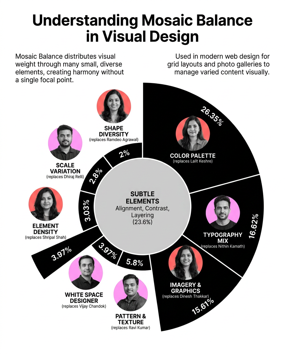
Mosaic balance, sometimes called crystallographic balance, spreads visual weight evenly across the whole composition with no single dominant focal point. Instead of one hero element, you get a field of many small elements of similar weight, like a pattern or a grid of equally sized tiles.
This works well for showcasing a large set of similar items (a portfolio grid, a collection of icons, a set of testimonials) but it's a poor choice whenever you need the reader's eye to land on one specific thing first.
05. Discordant Balance
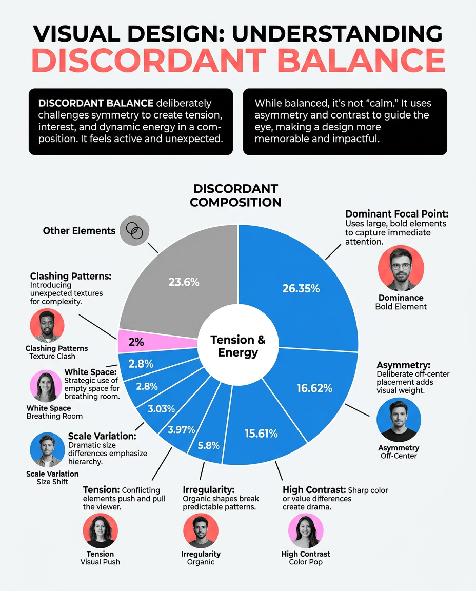
Discordant, or off-balance, design breaks the rules on purpose. Elements are placed to feel unsettled or tense rather than resolved. It's a legitimate creative choice for content that wants to provoke a reaction — an album cover, an edgy campaign, a piece built around conflict or disruption — but it's rarely the right choice for anything meant to build trust or explain something clearly. Reach for it deliberately, not by accident.
Why Balance Matters More Than It Gets Credit For
An unbalanced design does something specific to a reader: it creates friction before they've even processed the content. Their eye keeps getting pulled toward whichever element is overpowering the rest, instead of moving through the layout in the order you intended.
This matters most in infographics and quick-scroll content, where you often have one shot at guiding someone's attention before they move on. Good balance is what lets a reader's eye land on your headline first, then your key stat, then your supporting detail — all without you having to add arrows or instructions telling them where to look. The layout itself does that work.
Poor balance also erodes credibility in a subtler way. A lopsided, cluttered, or visually tense design reads as unpolished even to people who couldn't tell you why, and that impression attaches itself to whatever brand or message the design was carrying.
How to Check Balance in Your Own Work
Here's a process you can run on any design before you publish it, whether you built it by hand or generated it.
Using a Grid to Make Balance Almost Automatic
A grid is one of the fastest ways to get to balance, and it's a step a lot of guides skip over. Divide your canvas into equal columns and rows (a simple 3x3 or 4x4 grid works for most infographics), then snap your elements to those lines instead of eyeballing their position.
Grids help with balance in a specific way: they force consistent spacing between elements, which removes one of the most common causes of an unbalanced layout — gaps that are slightly different sizes in different places, which the eye reads as sloppy even when it can't explain why. A grid doesn't guarantee balance on its own; you can still put a huge, heavy element in one grid cell and nothing in the rest. But it removes the guesswork around alignment and spacing, so you can focus your judgment on weight instead of position.
For asymmetrical layouts specifically, a grid also gives you a way to measure imbalance. If one side of your design spans three columns of content and the other spans only one, that's a visible, countable signal that you may need to add weight (a bigger icon, a stronger color) to the lighter side.
A Worked Example: Balancing a Simple Stat Graphic
Say you're building a graphic with one big headline stat, a supporting sentence, and a small logo. Walking through how the balance decision actually plays out makes the abstract version above concrete.
Start with the stat. It's the heaviest element by default because of its size, so it needs to anchor whichever half of the page carries the most visual weight. Place it high and slightly off-center rather than dead center, since dead center tends to feel static for a single dominant element.
Next, the supporting sentence. On its own it's much lighter than the stat, both in size and in color if you keep it in a muted gray or your secondary brand color. To keep the page from feeling top-heavy, give that sentence some room to breathe below the stat rather than crowding it directly underneath.
Finally, the logo. It's tiny, but because it sits alone in a corner with nothing else nearby, it picks up more visual weight than its size would suggest. That's usually enough to balance out empty space on the opposite side of the page without needing another large element at all.
Notice what didn't happen: nothing got mirrored, nothing got resized, and no element was made technically "equal" to any other. The page still holds together because each piece was placed with its actual weight in mind.
Which Type of Balance Should You Actually Use?
| Balance type | Feels like | Best for | Watch out for |
|---|---|---|---|
| Symmetrical | Formal, stable, orderly | Certificates, reports, comparison infographics, anything needing to feel official | Can look flat or templated if overused |
| Asymmetrical | Dynamic, modern, considered | Social posts, marketing infographics, most everyday content | Takes more practice to judge weight correctly |
| Radial | Focused, centered, guided | Hub-and-spoke diagrams, mind maps, single-stat graphics with supporting context | Weak center point makes the whole layout feel adrift |
| Mosaic | Even, patterned, collective | Portfolios, icon grids, testimonial walls | Wrong choice when you need one clear focal point |
| Discordant | Tense, unsettled, provocative | Edgy campaigns, content built around conflict or disruption | Wrong choice almost anywhere trust or clarity matters |
Symmetrical
Feels like: Formal, stable, orderly
Best for: Certificates, reports, comparison infographics, anything needing to feel official
Watch out for: Can look flat or templated if overused
Asymmetrical
Feels like: Dynamic, modern, considered
Best for: Social posts, marketing infographics, most everyday content
Watch out for: Takes more practice to judge weight correctly
Radial
Feels like: Focused, centered, guided
Best for: Hub-and-spoke diagrams, mind maps, single-stat graphics with supporting context
Watch out for: Weak center point makes the whole layout feel adrift
Mosaic
Feels like: Even, patterned, collective
Best for: Portfolios, icon grids, testimonial walls
Watch out for: Wrong choice when you need one clear focal point
Discordant
Feels like: Tense, unsettled, provocative
Best for: Edgy campaigns, content built around conflict or disruption
Watch out for: Wrong choice almost anywhere trust or clarity matters
Common Balance Mistakes Worth Watching For
The most frequent mistake is confusing "centered" with "balanced." Centering an element on the page doesn't automatically balance the composition around it, especially if that element is much heavier than everything else nearby.
The second common mistake is treating balance as a one-time decision made at the start of a design. Balance usually needs a second look after you've added your final content, since real headlines and real numbers rarely have the exact same visual weight as the placeholder text you started with.
The third is overcorrecting into rigid symmetry out of fear of getting it wrong. Perfect mirror symmetry is safe, but used on every single design, it starts to feel like nobody made a real layout decision at all.
Building Balance Without Starting From Scratch Every Time
The steps above work, but doing them manually on every single graphic you publish adds up fast, especially if you're posting regularly and don't have design training to fall back on.
This is where a locked, consistent design system pays off. If your brand's layout structure, color weighting, and spacing are already tuned for good balance once, every new piece of content built inside that system inherits the balance automatically instead of you re-solving the same problem from a blank page each time.
That's the approach behind Visly. You set your brand's style once, and every infographic generated after that keeps the same balanced structure, the same color weighting, the same spacing logic — without you having to manually check contrast, focal points, and negative space on every single post.
Try Visly free and see a balanced layout built for you in under 60 seconds. No credit card required.